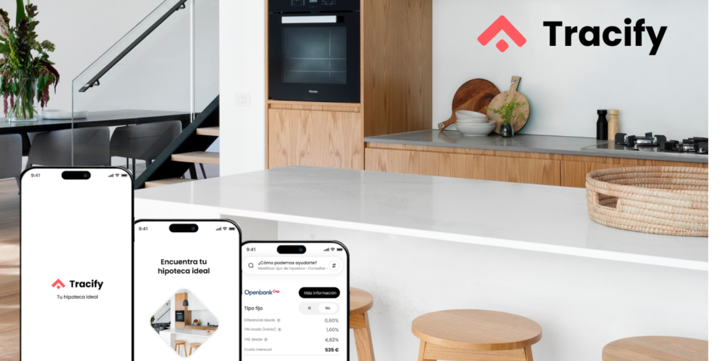
Getting a good mortgage is very complex nowadays. There is so much offer in the market that it is very difficult to make an accurate comparison that allows making a good decision. The lack of time due to working a lot, or family responsibilities, limits the time users can dedicate to do it. Prototype
Is a mobile app in development that aims to simplify the search and comparison of mortgages for users. The project focuses on:
Designing an intuitive and accessible interface to facilitate navigation and use of the application.
Implementing a precise and easy-to-use comparison tool so that users can find the best mortgage for their needs.
Attention to the needs of users with different disabilities and time constraints.
The work as Product Designer included:
User research: interviews, empathy maps and creation of personas to understand the needs and pain points of users.
Design of wireframes and prototypes: creation of iterations of the application screens in paper and digital, with special attention to accessibility and usability.
Usability studies: testing with real users to obtain feedback and improve the design.
Implementation of improvements: incorporation of user feedback to optimize the user experience.
Design Process structured over the 9 months of work
Discoveries before starting project
The price of mortgages continues to rise day by day, making saving increasingly difficult for households.
The mobile phone has become the main source of web traffic, surpassing the computer for millions of people worldwide, who have gone from not having a computer to acquiring a smartphone.
Users increasingly turn to online comparators to make informed purchasing decisions.
In addition to these factors, if there is any technical or development limitation, it would be time to consider it, even before considering the user research stage.
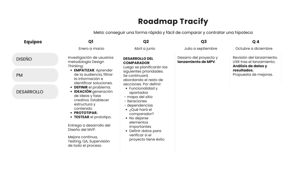
Roadmap
Pain points during the process
Bad time estimation.
Unrealistic expectations.
Not setting SMART goals.
Risks associated with users for not carrying out a good study.
Factors related to the environment (COVID, Wars).
Integration problems.
Lack of communication.
Lack of documentation.
Skimp on quality control.
Inadequate design.
Weak motivation.
Delays.
Problem solving
Obtaining good mortgage conditions is very complex nowadays.
There is a lot of offer on the market, making it difficult to make the necessary comparisons to make a good decision.
Lack of time due to work or family responsibilities limits the time that users can dedicate to doing so.
Goal
Create an accurate and easy-to-use APP to compare mortgages. Helping users throughout their journey.
User research
After 150 interviews, I created empathy maps to understand users and understand what their needs are. A group of primary users identified through the research were single working adults who have savings and a good salary that allows them to take the step, another belongs to people who, due to changes in their family situations, decide to take the step.
These two groups confirmed the initial assumptions about the potential users of the application, but the research also revealed that time was not the only factor that limited users when it came to spending time searching for a mortgage, but that other factors will be discovered: user problems such as obligations, interests or challenges that prevented them from making the comparison.
We also discovered another group of users that we had not taken into account at the beginning, which would be people with disabilities that make it difficult for them to consult mortgages and visit banks.
Pain points:
Time. Working adults are too busy to spend time visiting and consulting banks for comparison.
Accessibility. Many mortgage application platforms are not equipped with assistive technologies.
User interface. The services offered often contain a lot of text in the applications, which made them difficult to read and understand.
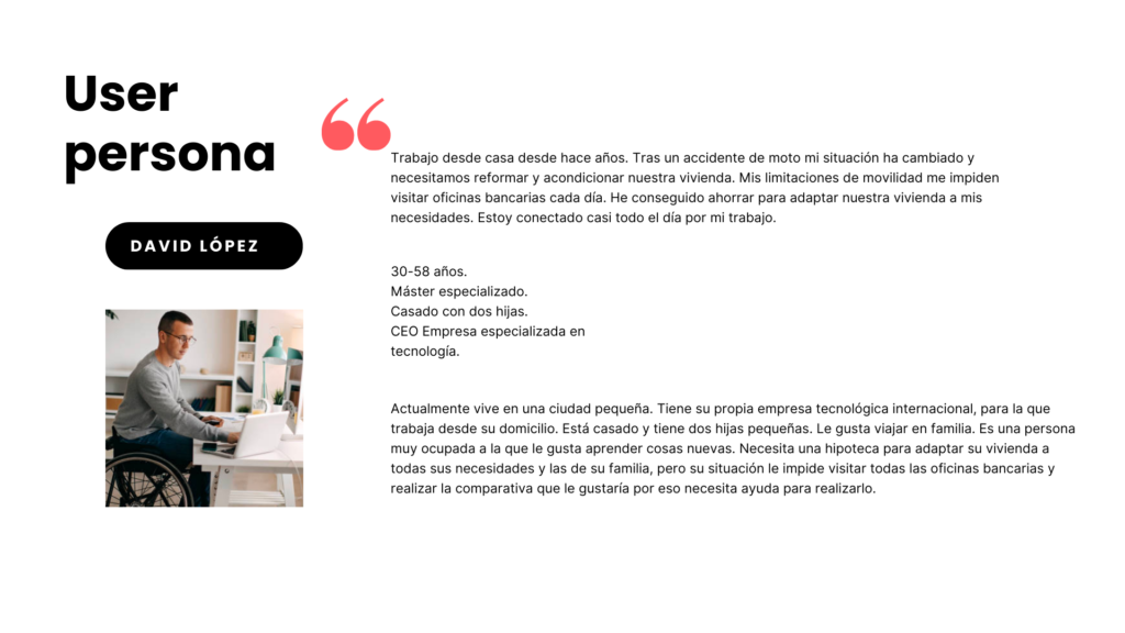
User persona
Busy working people who need easy access to mortgage comparison options because they don’t have time to do it themselves.
User persona
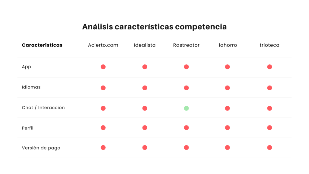
Características de la competencia
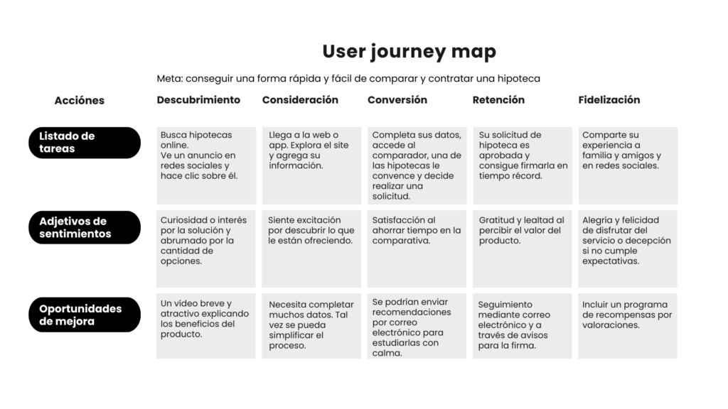
User journey map
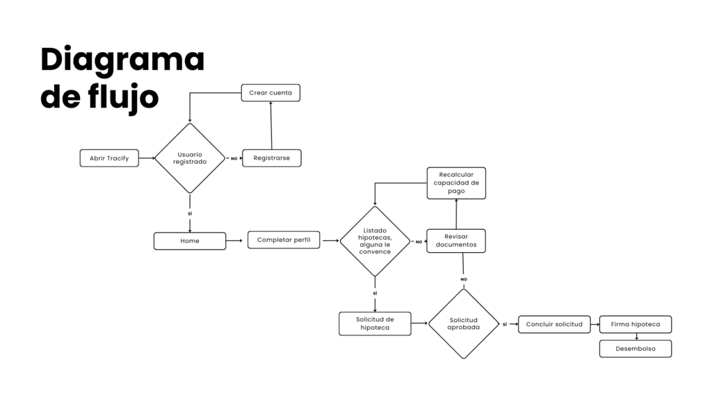
Flowchart
Designing began
Wireframes on paper
Iterating each screen on paper ensured that the elements that made it into the digital wireframes were the right ones to address user pain points.
Digital wireframes
I base the screen designs on user feedback and research findings.
Easy navigation was a key user need that needed to be add in the designs.
The app needs to work with assistive technologies.
Low fidelity prototype I created a low fidelity prototype. Using the flow of entering the application and completing the profile data to make a request. The prototype could be used in a usability study.
Usability Study Findings
I did two rounds:
First round findings: Users need to see how the mortgage comparison works depending on whether they are fixed or variable. Users want quick access to the delivered documentation.
Second round findings: I need to add more data to the comparison. I need to add complete flows to the services.
Mockups
The first designs allowed for some customization, but after usability studies, I added additional options. I revised the design so that users see all the available services as soon as they first land on the App.
The second usability studies revealed that a minimum flow had to be simulated to understand how the prototype worked. You should simplify the process and add the profile form to the App onboarding.
High fidelity prototype
The final prototype improved user flows, simplifying requests and comparisons. It also fulfilled user requests to include quick access to documentation.